THE KITCHEN REFRESH
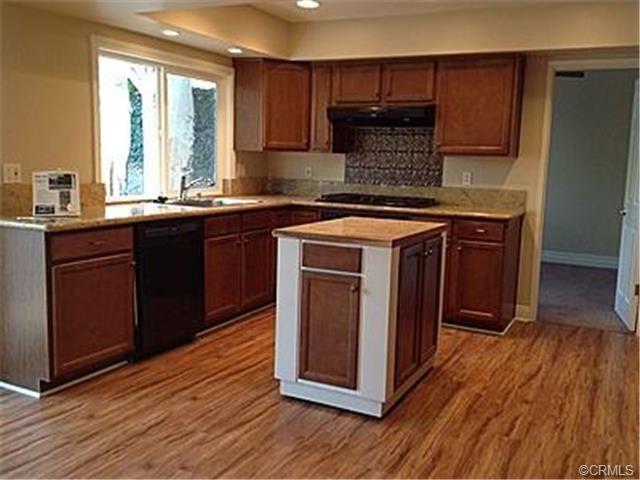
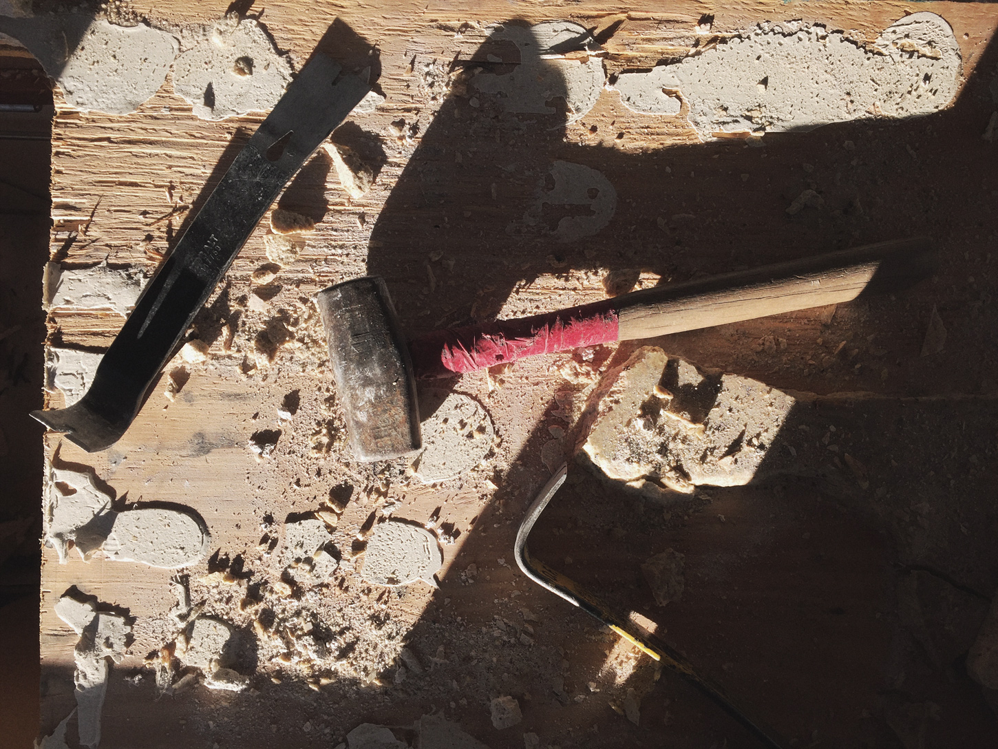
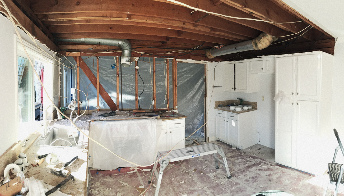
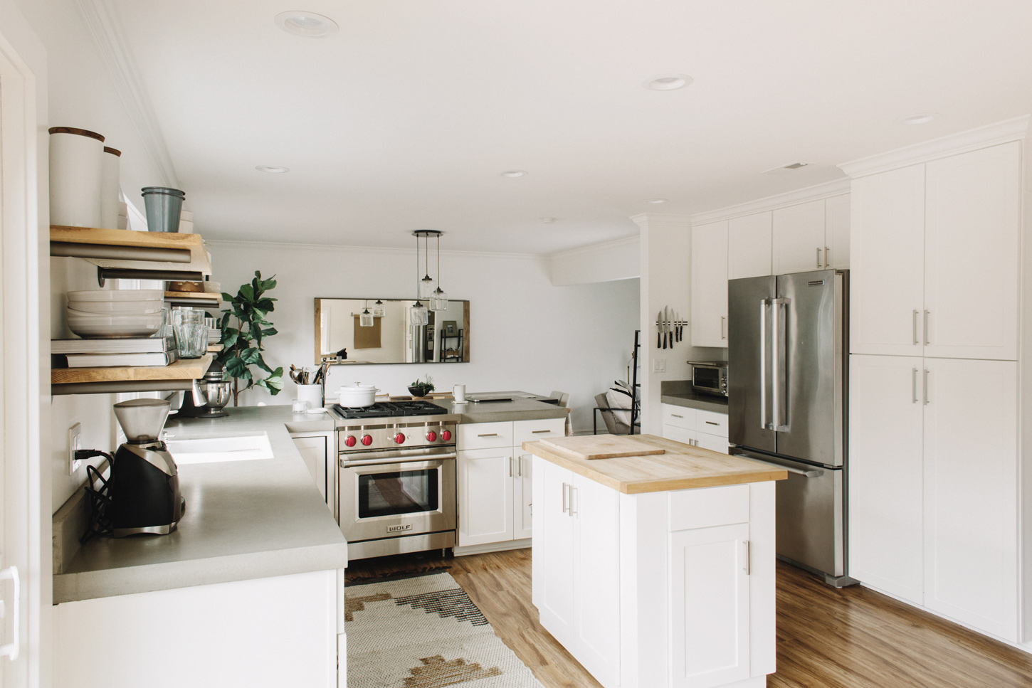
We started demo in our kitchen about a year and a half ago. Our house was built in the early 70's, and while it seemed there had been some updates made at some point in the late 80's / early 90's, the place as a whole had been pretty stagnant for a good 20 years when we moved in. A few things that the previous owners did themselves but we knew we bought a project to make this home feel like us. Budget and time permitting, we will be fixing this place up until we likely die here with a garage full of half empty bags of mortar, partial gallons of unused paint and spare tile pieces. Can you see Hugh rolling his eyes at me through your screen? The goal was to not completely start from scratch but more to spruce up what already existed. Of course, when you're just talking about renovation plans it all seems breezy and wonderful: "Yeah, we'll take out this part of the wall here, update the counter tops, paint, hardware, we can do all this ourselves in like, what, a week, right?" Then you put a hole in the drywall and you discover the first glimpse of the boot leg wiring from 20 years ago. Needless to say, it became more complicated than we imagined. I threatened to move out 8 months pregnant and cried a lot and there is still drywall dust wafting about, but I am so much happier in the kitchen now - a place I am so tied to both by choice and responsibility.
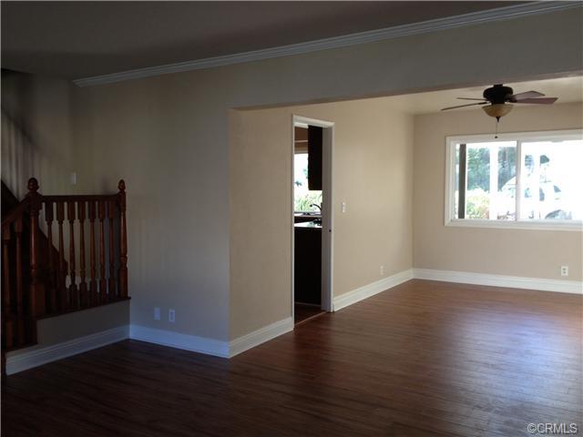
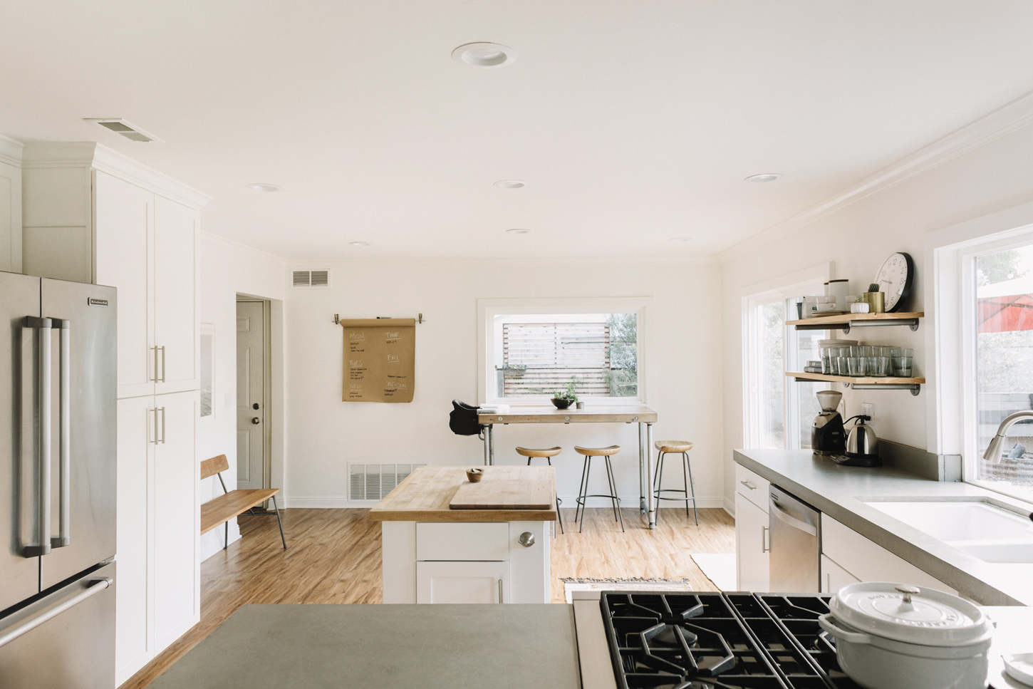
I can't define our style at all which shows you I have no business posting home stuff, but it's some marriage of industrial, mid century, natural/neutral/clean, with a hint of bohemian. I work and live in the kitchen (Hugh has a teeny tiny office in the garage) and clutter makes me feel anxious, so we tried to keep straight lines, lots of white, and natural tones and textures to make it feel calm. It's sort of tricky to tell in the photos but the kitchen/dining and living area are all open to each other now. While I like this in regards to entertaining and our family feeling together, you need the whole space to make some visual sense together because you can see all three spaces at one time. Does that make sense? I feel like I am still working on this part.
Hugh's dad is a wonderful and generous man, and a general contractor to boot, so he and Hugh did most of the work themselves, with some help for plumbing, electrical and paint. This helped make it affordable for us in the first place. The picture window above the kitchen table as well as the sink were scrounged from other homes he was working on at the time and repurposed here. I am in major debt to that man and inspired by his servant's heart and how much he wants to help his kids.
I meant to be sharing this post nearly a year ago, but it turns out that I don't think we'll ever be "finished." We have two young kids and both work from our home so we are here A LOT. How we move and feel in this space changes, so instead of wait until it is *just* how I want it, I figured I would share how far we've come, because the pursuit of perfect is missed joy. It is not perfect or done, but this house is so much more us than it was three years ago.
Included are some before (thanks Zillow!) and after shots for reference. I have included links for some of the goods below. I always enjoy seeing people's personal space - it's amazing how much it reflects their taste and temperament. I'm no decorator, but if you have any questions, leave them in the comments and I'll get back to you
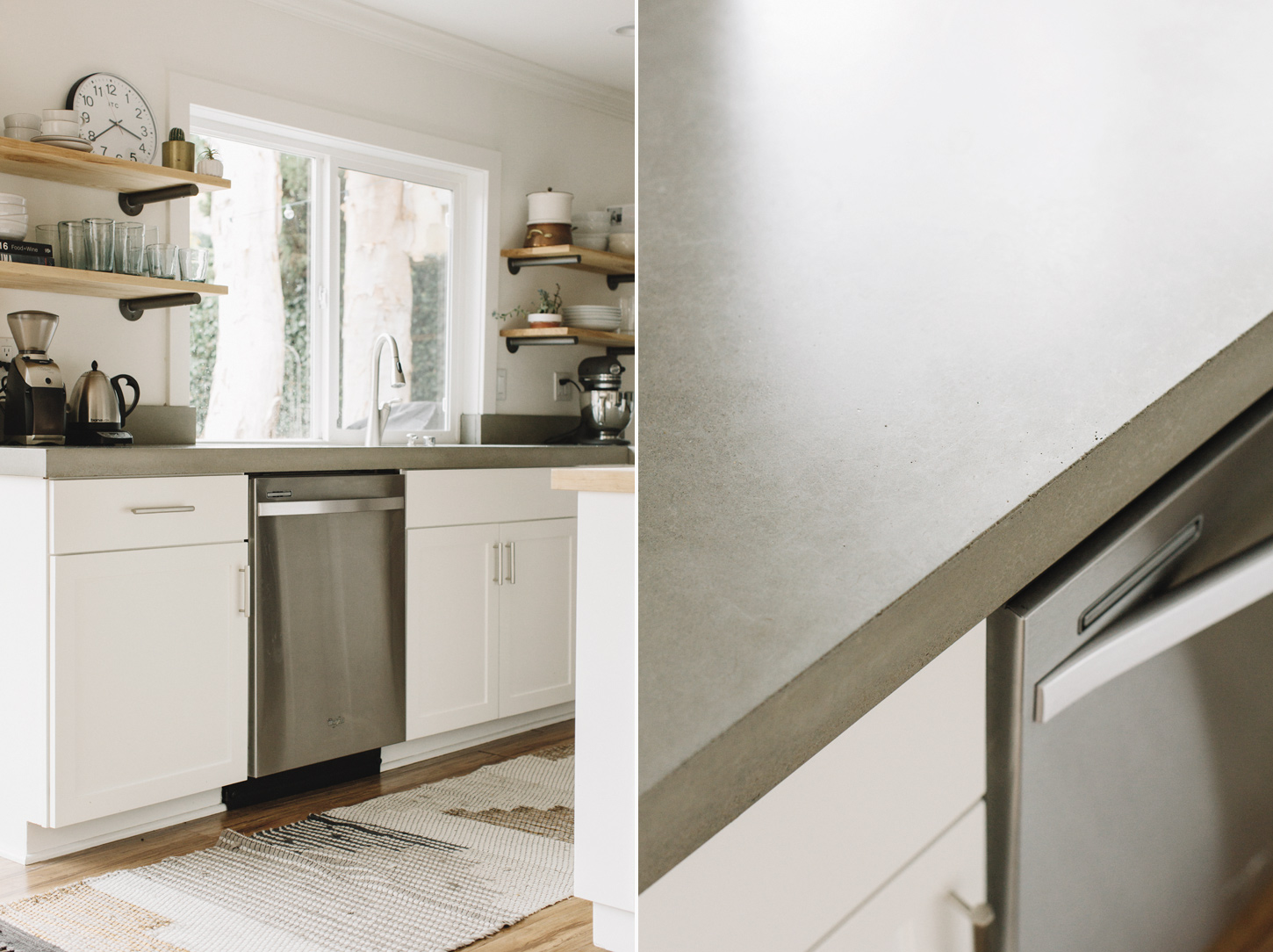
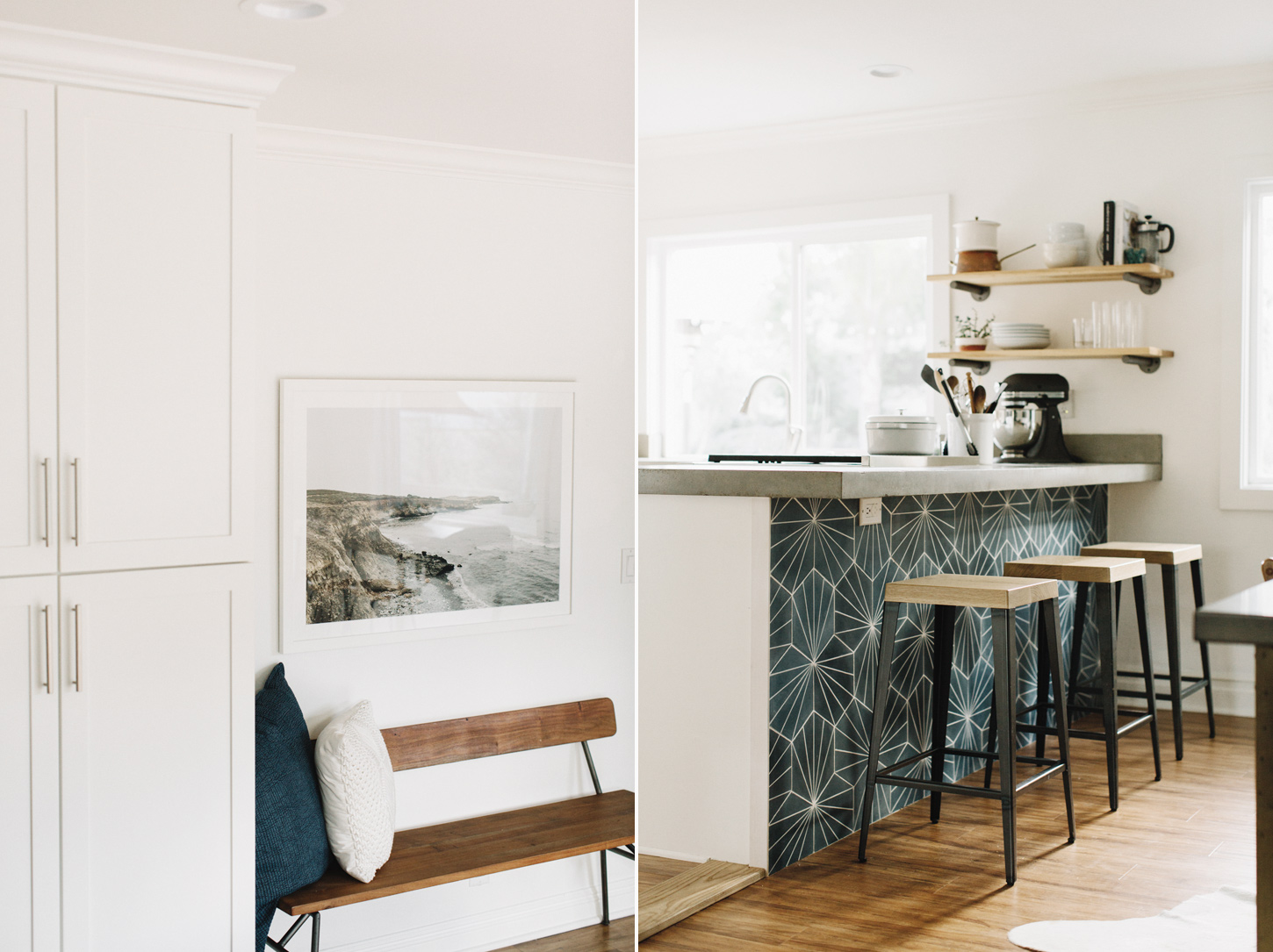
We worked with Concrete Wave Design to do concrete countertops. Some contractors pour them in place, but Concrete Wave measures and does them off site and then comes and installs. They look amazing and we are so happy with the work (they make fireplaces and neat sink basins too). We were warned against concrete by a few people because it's porous and not the most indestructible of countertop options. But this natural wear and patina was a positive deciding factor for us, over the more perfect looking materials and we love them for that. I would get them again in a heartbeat if we were tearing down our kitchen tomorrow.
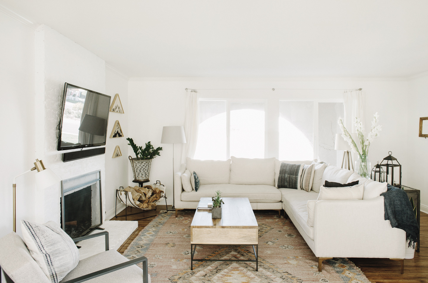
We hang out in our kitchen for the most part, but the family room is where our family plays blocks, sits by the fire, watches movies, and Hugh and I read or work on the rare occasion that both kids are asleep at the same time. We had a 15 year-old, hand-me-down couch from my parents that we replaced with a sectional from Interior Define. They are able to customize the lengths of the designs they have to fit perfectly in your space and have a variety of different fabrics that are sturdy and will for sure hold up under the use of our family. I may regret this light of a color with the kids but I just couldn't get past my desire for a light couch in that room to keep it looking bright and airy.
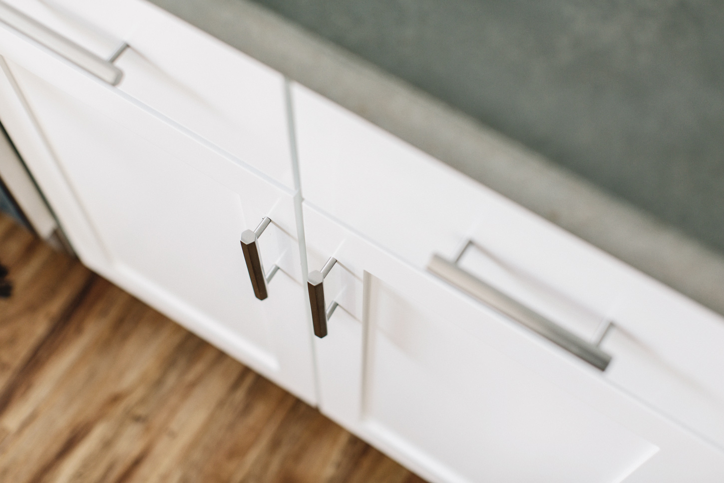
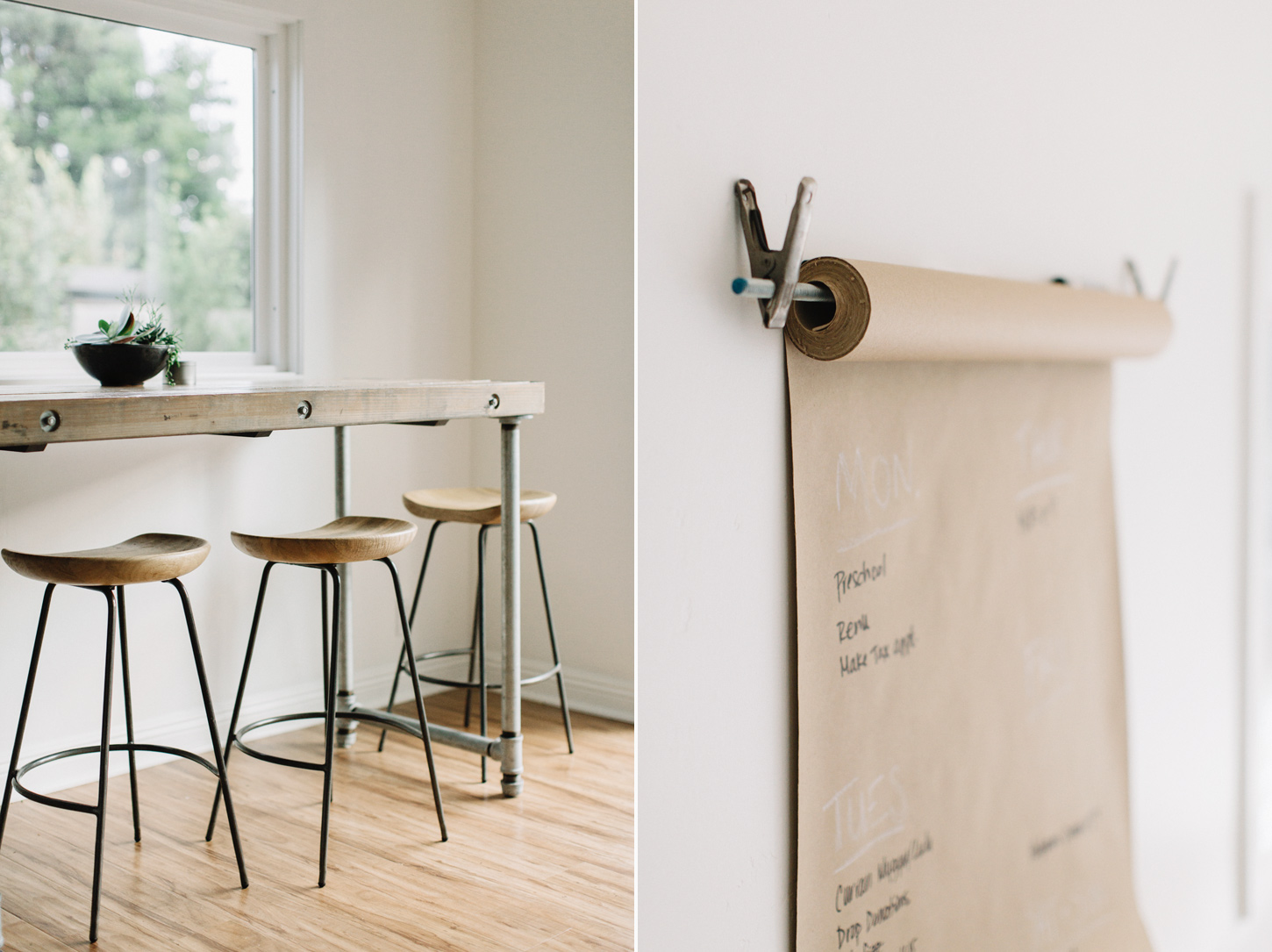
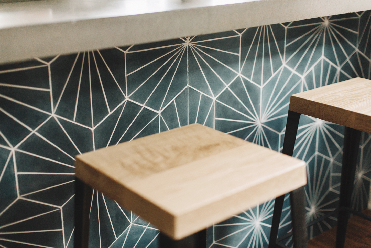
The hardware, stools and rugs are from Rejuvenation (specific links below). Since we chose this hardware they have added even more awesome options. They are beautiful, sturdy and easy to install. Even if you want to do one small thing to your kitchen, changing the hardware seems to make a big difference. The Skyline rug in the living area worried me with the pink but it blends in so well and adds the perfect amount of color to our pretty neutral palate. The stools at the bar area are sturdy and heavy and feel like they fit in just perfectly.
--
Paint: Dunn Edwards Whisper
Hardware: Rejuvenation
Countertops: Concrete Wave Design
Shelving Brackets: Restoration Hardware
Rugs: Rejuvenation (Skyline (I'm seriously obsessed!) and Woodmere)
Tiles: Cement Tile Shop
Photo: Hugh Forte and Framebridge
Bench: CB2
Stools: West Elm and Rejuvenation
Couch: Interior Define
Lamp: Rejuvenation
Some of these companies are partners in this post by way of product or discounts for pieces we love. We partner with companies whose products we love and trust in quality - food and otherwise. None of this information was paid for or commission based, all opinions are my own.


